

What is Web Design?
Web design refers to the design of websites. It usually refers to the user experience aspects of website development rather than software development. Web design used to be focused on designing websites for desktop browsers; however, since the mid-2010s, design for mobile and tablet browsers has become ever-increasingly important.

A web designer works on a website’s appearance, layout, and, in some cases, content.
- Appearance relates to the colors, typography, and images used.
- Layout refers to how information is structured and categorized. A good web design is easy to use, aesthetically pleasing, and suits the user group and brand of the website.
- A well-designed website is simple and communicates clearly to avoid confusing users. It wins and fosters the target audience’s trust, removing as many potential points of user frustration as possible.
Responsive and adaptive design are two common ways to design websites that work well on both desktop and mobile.
What is Responsive Web Design?
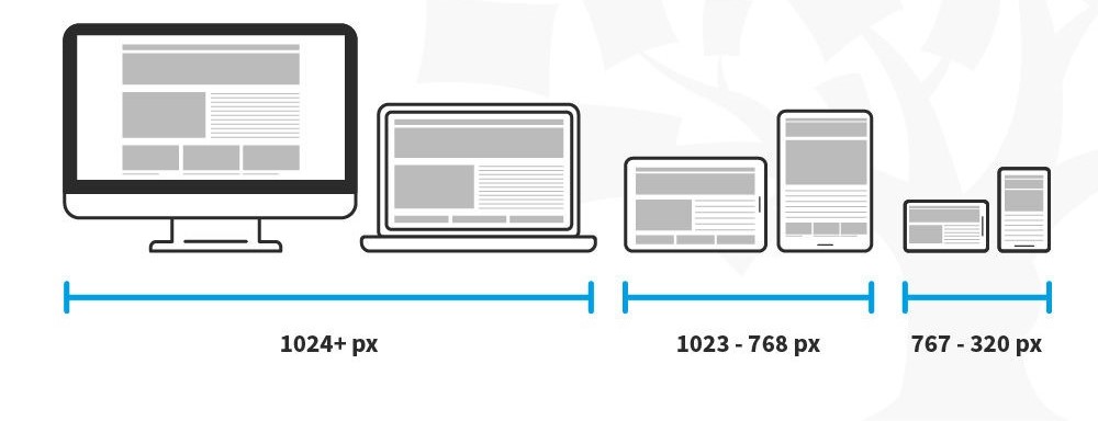
Responsive Web Design (a.k.a. “Responsive” or “Responsive Design”) is an approach to designing web content that appears regardless of the resolution governed by the device. It’s typically accomplished with viewport breakpoints (resolution cut-offs for when content scales to that view). The viewports should adjust logically on tablets, phones, and desktops of any resolution. Responsive designs respond to changes in browser width by adjusting the placement of design elements to fit in the available space. If you open a responsive site on the desktop and change the browser window’s size, the content will dynamically rearrange itself to fit the browser window. The site checks for the available space on mobile phones and then presents itself in the ideal arrangement.
Best Practices and Considerations for Responsive Design
- Take the mobile-first approach—start the product design process for mobile devices first instead of desktop devices.
- Create fluid grids and images.
- Prioritize the use of Scalable Vector Graphics (SVGs). These are an XML-based file format for 2D graphics, which supports interactivity and animations.
- Include three or more breakpoints (layouts for three or more devices).
- Prioritize and hide content to suit users’ contexts. Check your visual hierarchy and use progressive disclosure and navigation drawers to give users needed items first. Keep nonessential items (nice-to-haves) secondary.
- Aim for minimalism.
- Apply design patterns to maximize ease of use for users in their contexts and quicken their familiarity: e.g., the column drop pattern fits content to many screen types.
- Aim for accessibility.
What is Adaptive Web Design?
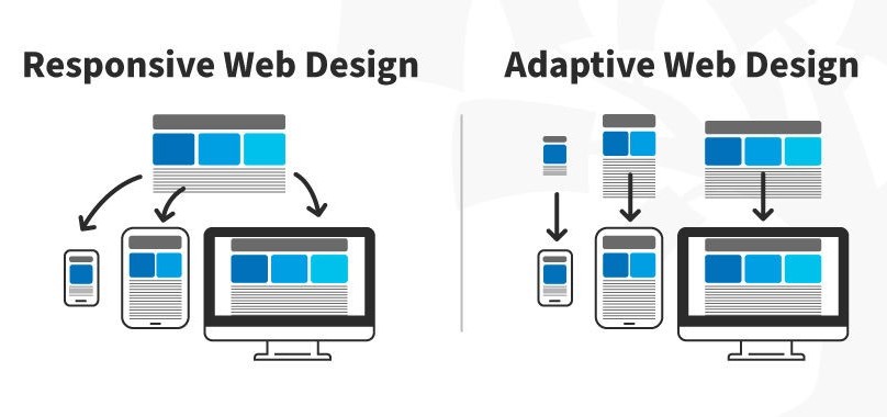
Adaptive design is similar to responsive design—both are approaches for designing across a diverse range of devices; the difference lies in how the tailoring of the content takes place.
In the case of responsive design, all content and functionality are the same for every device. Therefore, a large-screen desktop and smartphone browser displays the same content. The only difference is in the layout of the content.
In this video, CEO of Experience Dynamics, Frank Spillers, explains the advantages of adaptive design through a real-life scenario.
Adaptive design takes responsiveness up a notch. While responsive design focuses on just the device, adaptive design considers both the device and the user’s context. This means that you can design context-aware experiences—a web application’s content and functionality can look and behave very differently from the version served on the desktop.
For example, if an adaptive design detects low bandwidth or the user is on a mobile device instead of a desktop device, it might not load a large image (e.g., an infographic). Instead, it might show a smaller summary version of the infographic.
Accessibility for Web Design
“The power of the Web is in its universality.
Access by everyone regardless of disability is an essential aspect.”
—Tim Berners-Lee, W3C Director and inventor of the World Wide Web
Web accessibility means making websites and technology usable for people with varying abilities and disabilities. An accessible website ensures that all users, regardless of their abilities, can perceive, understand, navigate, and interact with the web.
In this video, William Hudson, CEO of Syntagm, discusses the importance of accessibility and provides tips on how to make websites more accessible.
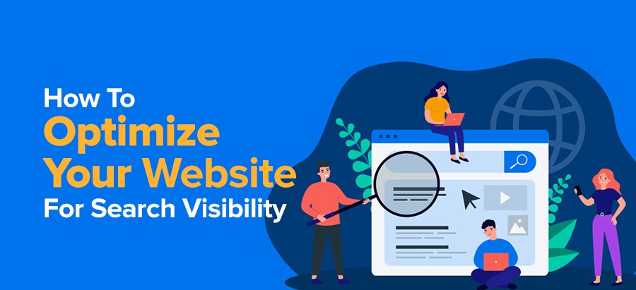
How can I improve my website search ability?
Taking these steps can help to improve your website SEO.
1. Understand your online customers.
2. Use keywords on your website.
3. Update your content regularly.
4. Gain referrals from other websites.
5. Use Meta tags in your content.
6. Stay up to date on the latest SEO techniques.
Learn More about Web Design
Learn how to apply the principles of user-centered design in the course Web Design for Usability.
For more on adaptive and responsive design, take the Mobile UX Design: The Beginner’s Guide course.
See W3C’s Designing for Web Accessibility for practical tips on implementing accessibility.


